Catalonia's openEHR CDR for 8 Million People
Catalonia wanted an openEHR Clinical Data Repository for 8 million people. Medblocks worked with IBM and vitagroup to design the sync layer for hospitals.
December 31, 2024
Designing for doctors isn’t easy - but the results are worth it. Have you ever wondered what it takes to create a screen that doctors rely on daily? We’re pulling back the curtain to share a glimpse of the process.
At Medblocks, we have been busy reinventing the Electronic Health Record (EHR). Our modern EHR is a modular, scalable platform that streamlines medical workflows and adapts to the needs of different healthcare specialities.
Our best work has always emerged through close collaboration with domain experts. This article explores a case study where we developed a comprehensive patient overview interface for an ophthalmology practice, leveraging the strong foundation provided by Medblocks UI.
As a designer, my focus is eternally on the usability and usefulness of every element on a page. When working with use cases that require representing large amounts of information, design is a powerful tool to ensure accessibility and ease of use. This was one such instance.
Before we dive into the problem, here is some essential terminology:
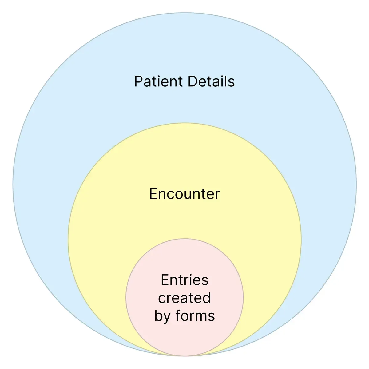
Encounter: Any instance when a patient visits the hospital, for a new issue or a follow-up is an encounter
Form: A form consists of various fields used to gather details about the patient, their presenting complaints, diagnoses or pre-existing illnesses
Entry: A summary of data recorded when a form is filled out, such as a vital form, past diagnoses, or information about pre-existing illnesses
 Our business problem was thus: Design a patient overview page that effectively presented detailed information from all past encounters in a format that is easy to view and understand.
I began by listing all the information we needed to display and prioritized them using data collected from user interviews. The following list emerged:
The primary challenge emerged when designing for encounters - patients could have multiple encounters and doctors need to be able to access a wide variety of details as quickly as possible. This is critical to understanding a patient’s context and aids decision-making.
Here we leveraged Encounter and Form Level summaries from the Medblocks Platform that provides customizable options to display patient information - both from an encounter and long term. I worked on further customizing this to provide extensive information in a concise and scannable manner.
Following standard practices, I began by looking into design layouts that catered to similar problems. In reviewing reports and overview screens from other EHR systems, I was able to determine what users were accustomed to, and the type of visual cues they would be familiar with.
One valuable insight was understanding that doctors are skilled at handling screens with high information density or cognitive complexity. This became a key consideration in subsequent design decisions and I focused on providing clear cues on priority and criticality of information.
 The first iteration drew inspiration from forms that doctors commonly use, that is typically structured in tables with fields for data entry. This is how the screen turned out:
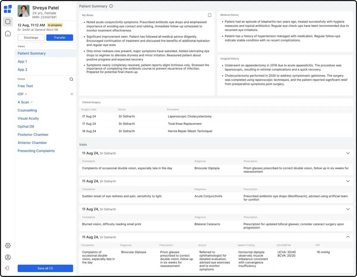 I assumed the familiar format would enable an easier transition to the digital interface. However, I was mistaken.
The plan was to represent encounters in a table containing all available encounters, which could be expanded to view entries within. This approach, however, had several issues:
The tables didn’t translate well to the screen. It was time for the next iteration, we reconvened as a team and restructured the data. In this attempt, we condensed the top widgets space, added visual cues, and displayed Encounter information in a simple and symmetric format. This is what the screen looked like:
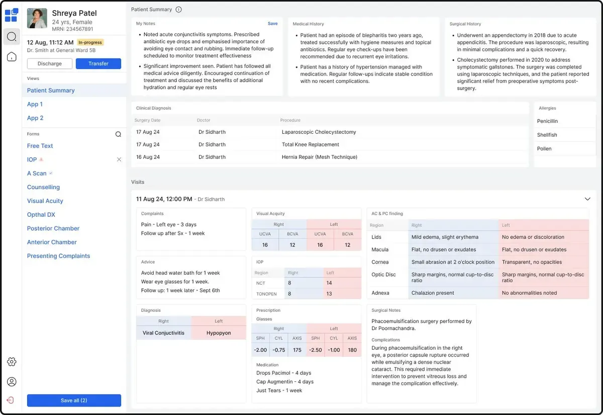 The colours blue and red are commonly used by ophthalmologists to represent the right and left eyes respectively. The widgets were designed as web components, allowing for custom layouts. However, problems persisted:
In the next iteration, we aimed to compress each element to display maximum data in the least space. The Level 1 widgets and encounter cards were made smaller to look like this:
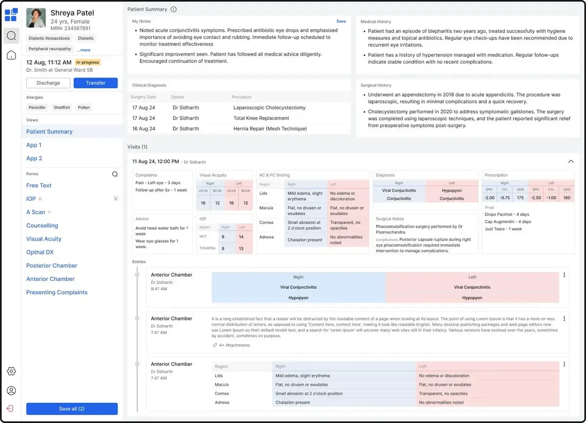 The top-level widgets looked great! However, the new timeline view for Entries did not get favourable responses, more entries could be accommodated in that space.
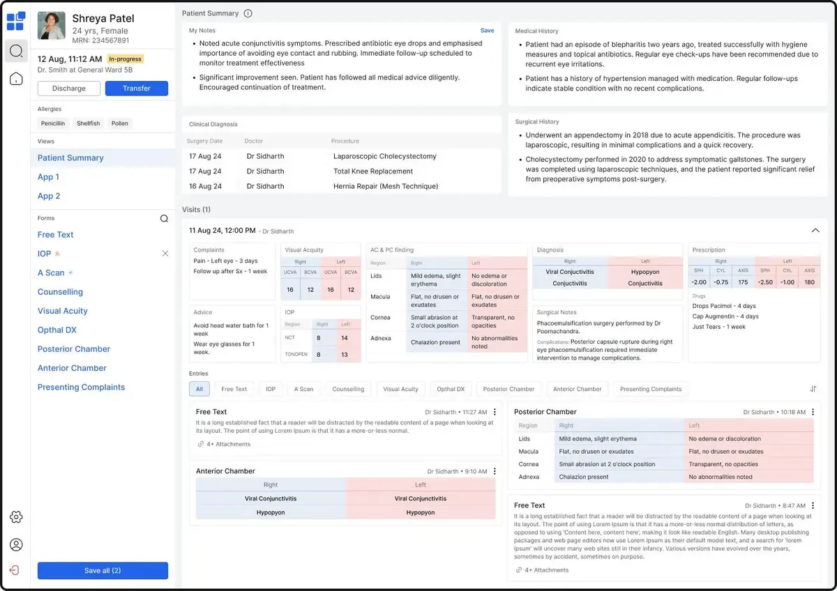
The next goal was to refine the layout of entries, I created two options that we evaluated based on the user experience.
This was the first:
And this was the second:
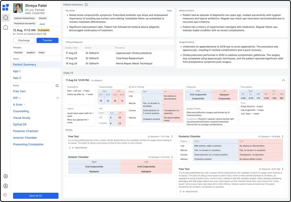 The first option allowed for greater customization, with buttons to switch between forms and sort entries chronologically. The second was a streamlined option that removed buttons and displayed the most recent entry at the top by default.
The second option best matched the client workflow and was approved for further development. It goes to show that more customization isn’t always the answer.
During data migration from the old EHR to the new system, a significant flaw emerged. Users were facing visual discomfort due to the contrast between empty and filled cells. This is what it looked like:
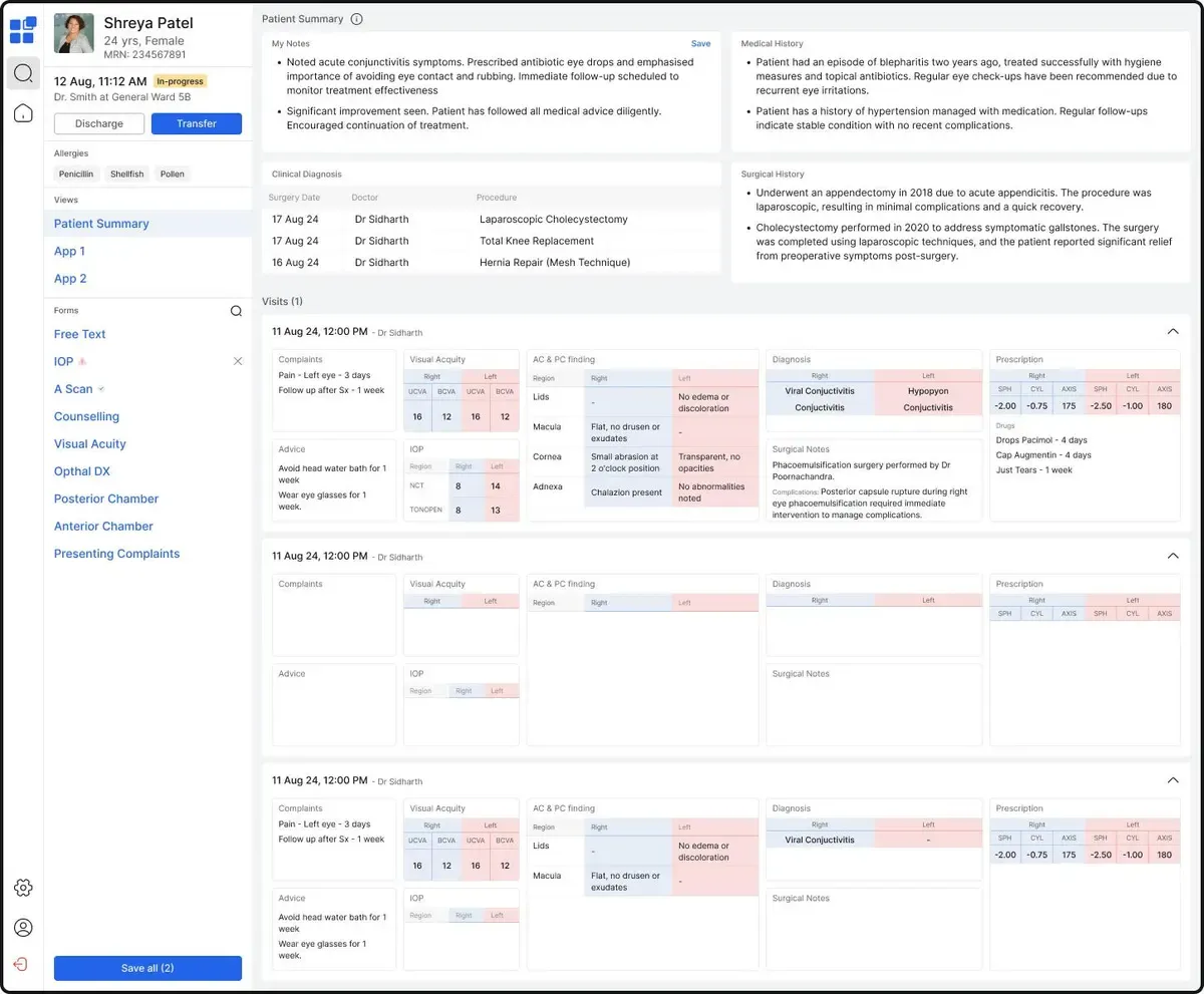 Back to the drawing board, we go.
 We had to arrive at a solution that retained colour cues but reduced the visual contrast. Reducing the use of colour by colouring only the table headers was an elegant solution to this problem - it preserved essential indicators for scanning while reducing visual clutter. We were also able to represent three entries instead of two, creating the high-information layout of our dreams.
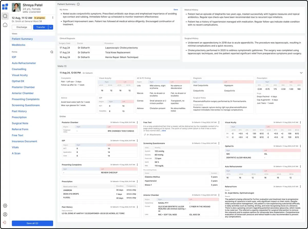 The design was ready to go, it was handed off to the development team for implementation.
Something didn’t feel quite right, let’s call it a designer’s intuition. The small cards bothered me - the borders weren’t quite enough to make them easily distinguishable and scannable. I spent time in trial and error to find an effective way to make the information and cards stand out.
 It’s the last iteration, I promise!
It was a simple solution. Adding a background to the entries and top data cards makes them easily distinguishable, it complements the visual cues and enhances their scannability.
Here’s the final version:
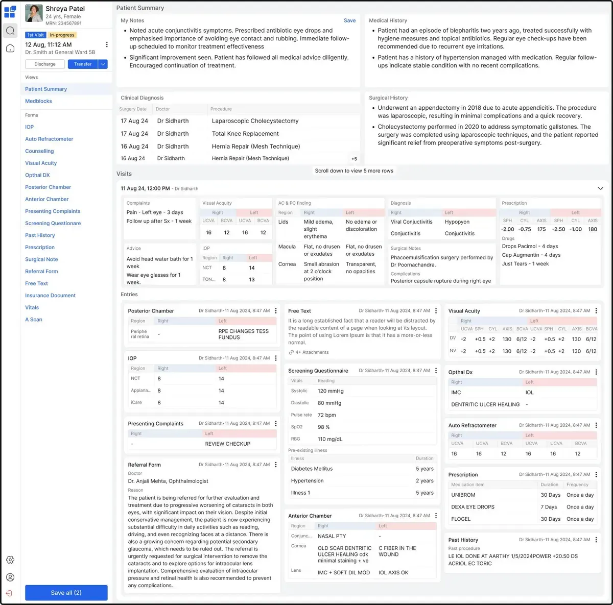
Testing this new design against the previous version proved my intuition right - it had better readability and accessibility. Finally, the designer in me was satisfied!🎉
The product was implemented and in use by Q4 2024.
After implementation, one of the ophthalmologists noted, “The new interface is intuitive, and I can find all the information I need in seconds!” which was exactly what we aimed for. By improving scannability, doctors could now access critical information 24% faster, enabling data-driven decision-making on the go.
This implementation was a design challenge like no other, simply due to the vast domain knowledge it attempts to serve. Interacting with domain experts and being able to pick their brains on each design variation, observing how the smallest changes could drastically alter usability was a huge learning experience.
As in this example, healthcare platforms that truly enable value-based care need to be developed in close collaboration with practitioners. Catering to specific practitioner needs while leveraging the power of open-source standards and frameworks is what we do best at Medblocks.
Are you trying to build a healthcare platform that serves you? Let’s collaborate to create solutions tailored to your requirements. Contact Us

Catalonia wanted an openEHR Clinical Data Repository for 8 million people. Medblocks worked with IBM and vitagroup to design the sync layer for hospitals.
We walk you through building a FHIR server on top of Couchbase's NoSQL database, covering challenges, technical decisions, architecture, and local setup.
Here we explore a real-world project we did with GE HealthCare, where we tackled the challenges of data normalization in oncology care.
No comments yet. Be the first to comment!